
SALLY'S ART
213978
ARTIST MOMENT #3
Red Cups.

1. Do you feel offended that the cup this year isn't expressive to holiday spirit? Why or WHy not?
I don't feel offended about this year's cup because although there is no unique designs on the cup as the previous years' design, however, I think the colors red, green, white already explained the christmas feeling to customers. In order for customers to create their own stories, the main designer Jeffrey Fields comprised two plain red colors into one which creates a total canvas form. The simpleness of the red cup reminds me of the Campbell Can pop art painted by Andy Warhol, which also shared a similar trait of plainness with the Starbucks cups. Even though Campbell soup was very familiar in the 1900s, Warhol still chose to recreate the original design of the cans into a pop art form because it will always be the most iconic symbol in popart no matter how ordinary the painting is.
2. Do you think the matter was blown out of proportion?
I think the matter was blown out of proportion once the cups were out, because some Christians made a political controversy over the fact that there's no christmas related symbols on the cups which was attacking to Christians. On the other hand, some non-Christians think it is not christmassy enough while others hold a positive view of the new cups. Since there are many political controversy about the religion of the design online, it is too easy to be spred out to the world by using social media.

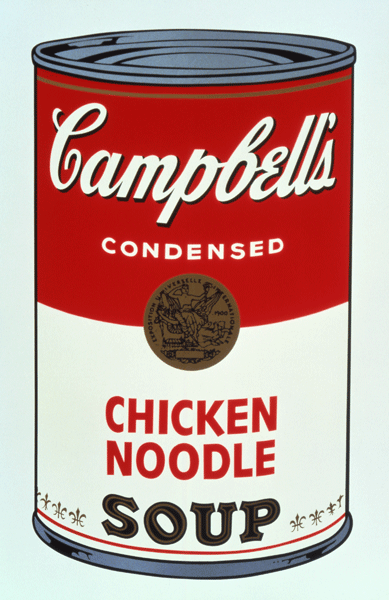
'Campbell Soup Can '
- Andy Warhol - 1960.
3. If you had to redesign the cup to appease Josh and non-Christians, how would you design your cup?
I would use the same color as the background and add some cute storyboard on the cup since it was intentionally made for customers to show their own stories. Not only the storyboard can provide customers to draw, the various designs of the frame can also attract kids to buy more hot drinks from Starbucks.
Sketch: